시각화 | Matplotlib 기초
matplotlib 라이브러리 기본 사용법
matplotlib: 파이썬에서 데이터를 그래프나 차트로 시각화할 수 있는 라이브러리
import matplotlib.pyplot as plt
그래프 그리기
두 가지 방법이 있다.
1. plt.plot()
state machine interface 방식
선(또는 점) 그래프
# plt.plot(x, y)
x = list(map(int, range(5))) # [0, 1, 2, 3, 4]
y = list(map(int, range(4, 9))) # [4, 5, 6, 7, 8]

plt.plot(x, y)
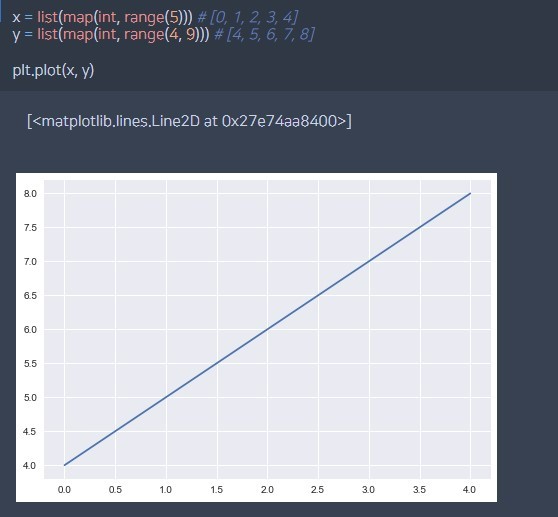
그래프 결과
해상도, 타이틀, 범주 등
### fig: 크기 조절, dpi: 해상도 설정(default: 100)
plt.figure(figsize=(4, 4), dpi=200)

### plot 라벨 범주 표현하기
plt.plot(x, y, label="x-y")
plt.plot(x, z, label="x-z")
plt.legend(loc="lower right")

### 그래프 타이틀
plt.title("[Example Plot]")

### x, y 라벨
plt.xlabel("X")
plt.ylabel("Y")

# 좌표평면 범위 조절
plt.ylim([0, 10])

# 눈금 추가/삭제 (스타일마다 default가 다름)
plt.grid()
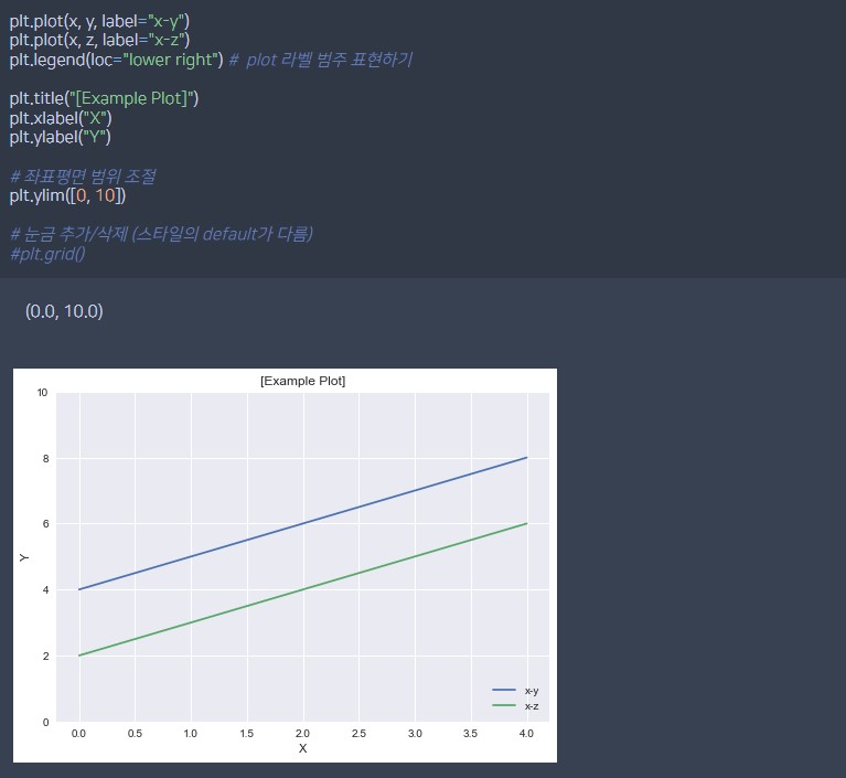
범주, 타이틀, 라벨 예시
Line Style
- 실선, 점선 등 선 스타일 변경 linestyle 옵션
- 선 위에 marker 표시
- marker 모양 변경 marker 옵션
x, y = np.array(x), np.array(y)

plt.plot(x, y,  linestyle="-", marker="o")
plt.plot(x, y+1, linestyle="--", marker="^")
plt.plot(x, y+2, linestyle="-.", marker="*")
plt.plot(x, y+3, linestyle=":")
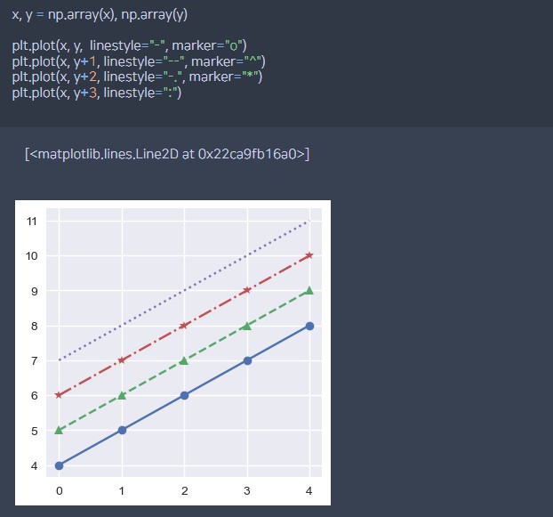
line style, marker 예시
2. plt.subplots()
object oriented interface 방식
# fig, ax = plt.subplots()
x = list(map(int, range(5))) # [0, 1, 2, 3, 4]
y = list(map(int, range(4, 9))) # [4, 5, 6, 7, 8]
z = list(map(int, range(2, 7))) # [2, 3, 4, 5, 6]

fig, ax = plt.subplots()
ax.plot(x, y)
fig: 전체 figure, 도화지라고 생각ax: 그래프 객체- 하나의 fig에 여러 개의 그래프를 그릴 수 있다.
- 하나의 ax에 여러 개의 선을 나타낼 수 있다.
subplots(nrow, ncols) 그리드 지정
#### plt.subplots(nrows=1, ncols=1) # int, default:1

fig, axes = plt.subplots(2, 1) # 2행 1열 그리드 (위 아래)

# 그래프 그리기
axes[0].plot(x, y)
axes[1].plot(x, z)
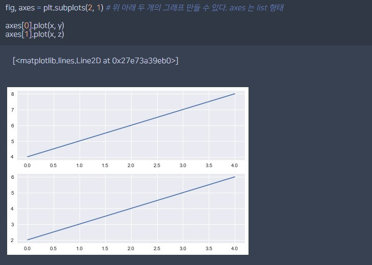
그리드 지정 그래프
subplots() 그래프 예시
plt.plot()으로 그리는 것과 동일하게 여러가지 옵션을 줄 수 있다.
x = np.arange(10)
fig, ax = plt.subplots()

ax.plot(
    x, x, label='y=x',
    marker='o',
    color='blue',
    linestyle=':'
)
ax.plot(
    x, x**2, label='y=x^2',
    marker='^',
    color='red',
    linestyle='--'
)
ax.set_xlabel("x")
ax.set_ylabel("y")
ax.legend(
    loc='upper left',
    shadow=True,
    fancybox=True,
    borderpad=2
)
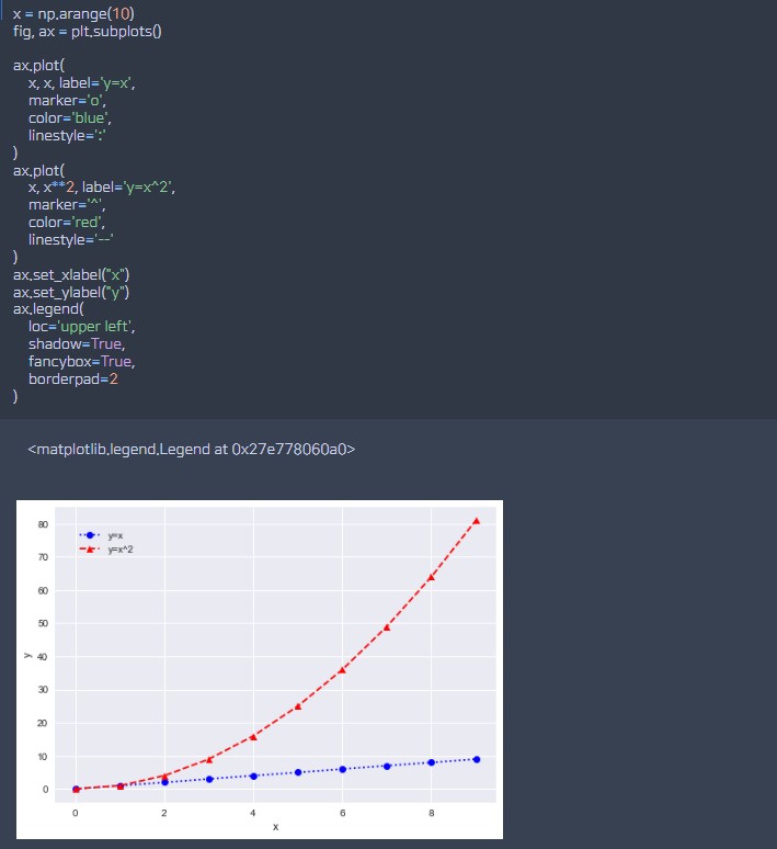
subplots() 옵션 예시
그래프 테마
단순히 그래프 선 색깔을 바꾸는 것 말고도 다양한 테마를 제공한다.
matplotlib stylesheet에서 다양한 스타일을 고를 수 있다.
import matplotlib.pyplot as plt

# 'seaborn' 스타일 사용 선언
plt.style.use("ggplot")
나는 ggplot이나 seaborn이 제일 예쁘고 눈에 잘 들어오는 듯
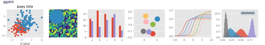
ggplot 스타일시트
다른 그래프: Scatter, Bar, Histogram
1. Scatter 그래프
plt.figure(figsize=(4, 4), dpi=100) # fig 크기 조절, 해상도 설정

plt.scatter(x, y, alpha=0.8, marker="*") # alpha: 투명도
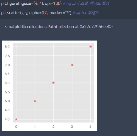
산점도 그래프 예시
pandas.DataFrame 산점도 그래프
import pandas as pd

df = pd.DataFrame(np.random.rand(100, 2));
print(df)

plt.scatter(df[0], df[1])
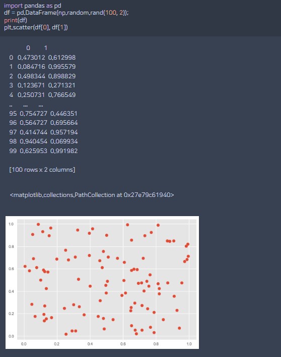
산점도 그래프 예시2
2. Bar 그래프
plt.bar(x=np.arange(5), height=3*x-1)
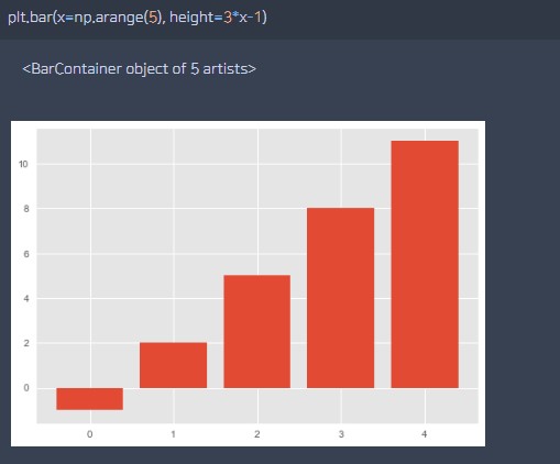
막대 그래프 예시
3. Histogram 그래프
plt.hist([1, 1, 1, 2, 3, 4, 2, 5])
# 값들에 대한 통계 (빈도수)
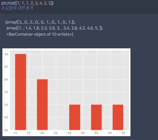
히스토그램 예시
Reference
- 다양한 matplotlib 예제를 보고 싶다면: example